UNIVERSITY OF CENTRAL FLORIDA

Making digital accessibility approachable for educators.

ROLE

UX Designer

TEAM

1 Designer, 2 Engineers

TOOLS

Figma, Gemini

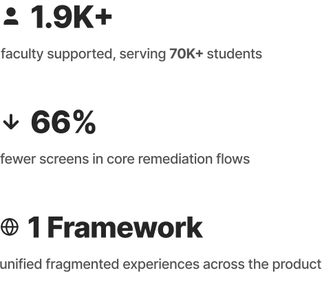
At the University of Central Florida, one of the nation’s largest universities with 70,000+ students and 1,900+ faculty, course content is created at massive scale. Ensuring that content is accessible presents a complex challenge. During my junior year, I joined UCF’s Center for Distributed Learning to help address this challenge.


UDOIT is an open-source Canvas LMS tool that helps instructors identify and remediate accessibility issues across their courses. As the sole UX designer on the project, I led an end-to-end redesign of the entire tool.

Problem

UDOIT could identify accessibility issues, but resolving them was fragmented and difficult to complete, leading to low adoption and incomplete fixes.

Objective

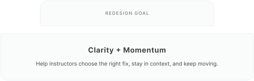
How might we unify fragmented remediation workflows into one consistent experience that helps instructors take action with confidence?

Outcome

THE TOOL

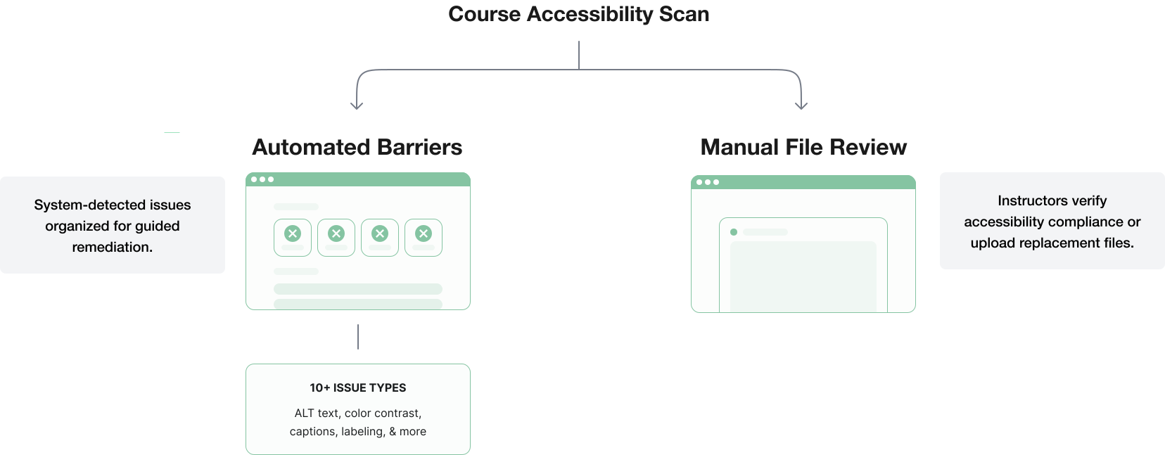
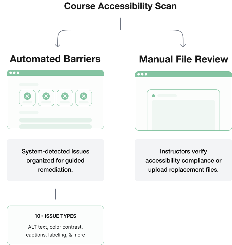
Two Paths to Accessibility Resolution

UDOIT guided instructors through two distinct remediation paths depending on the type of issue.

THE PROBLEM

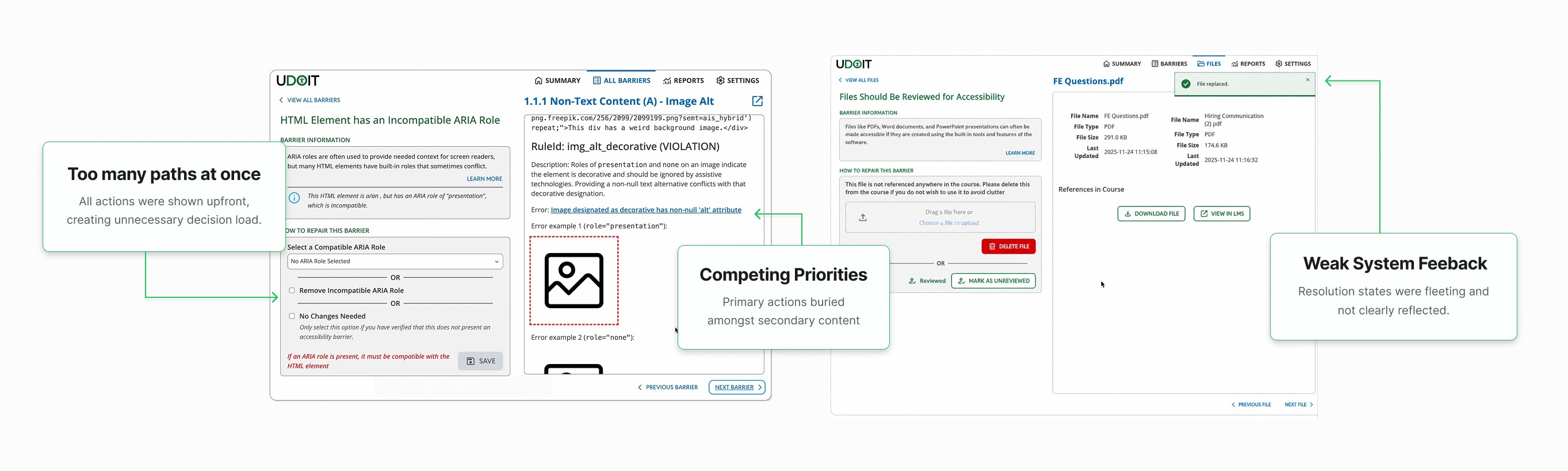
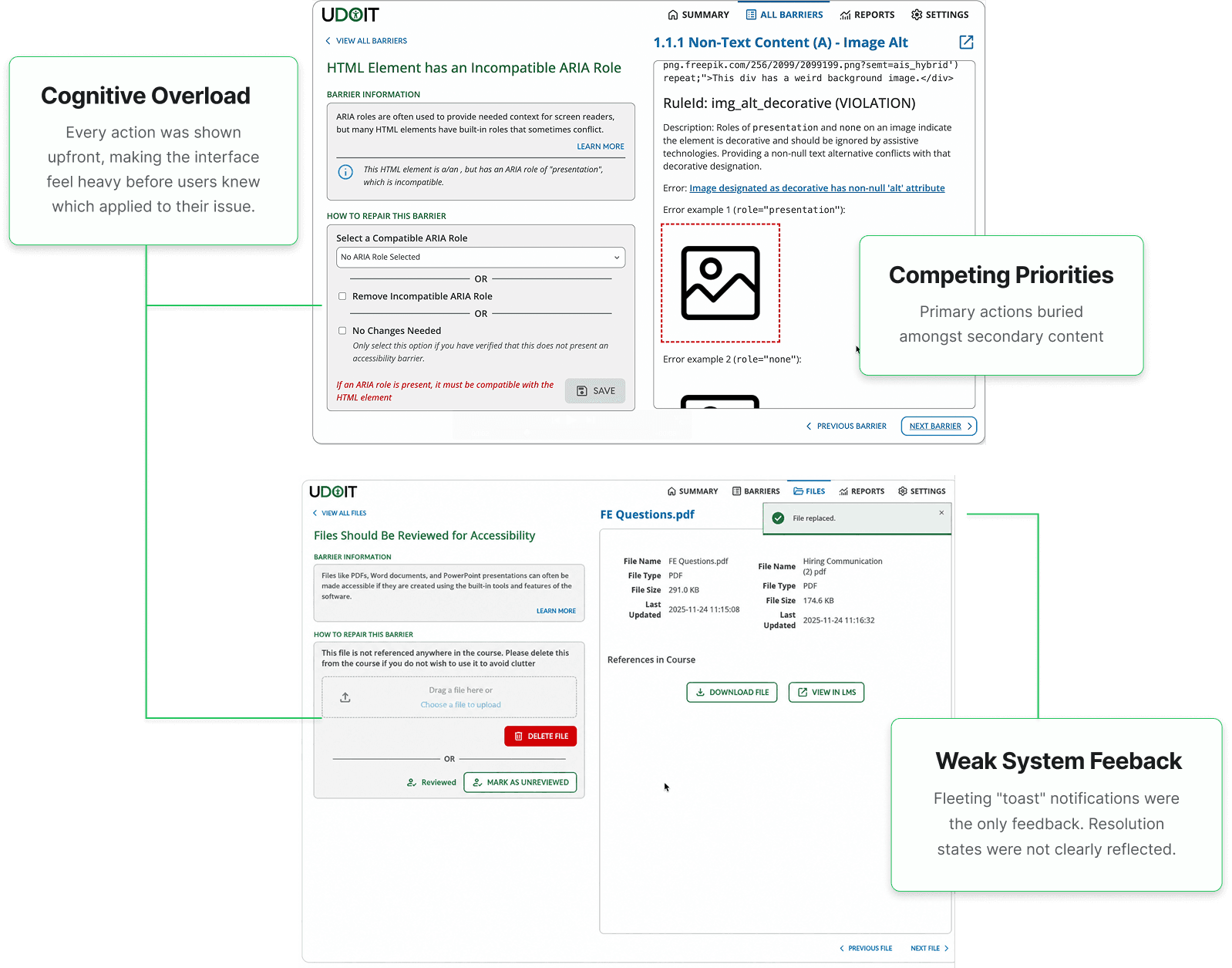
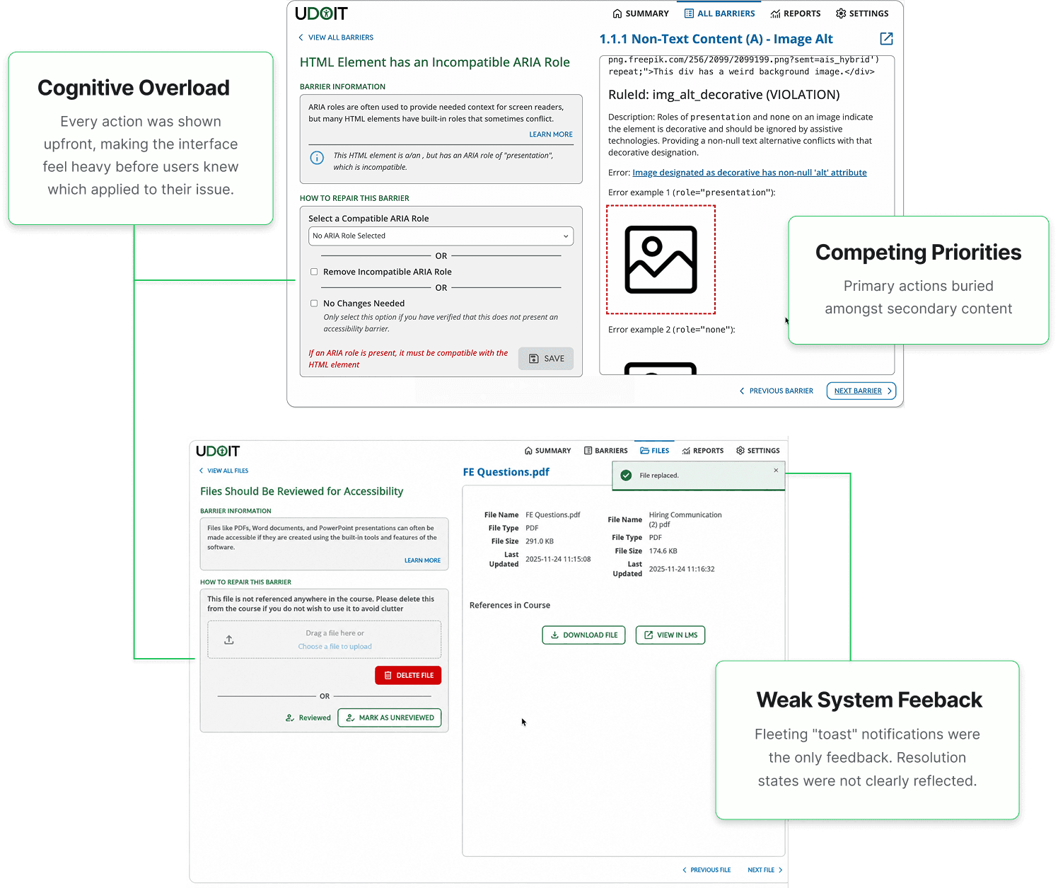
Fixing issues lacked a consistent workflow.

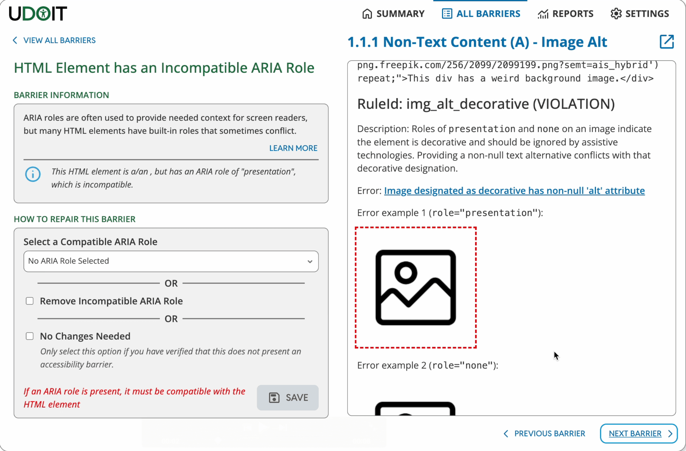
UDOIT could identify accessibility issues, but resolving them felt fragmented. Different issue types led instructors through different screens and action patterns, making remediation harder to understand and complete.

Original UI

THE SOLUTION

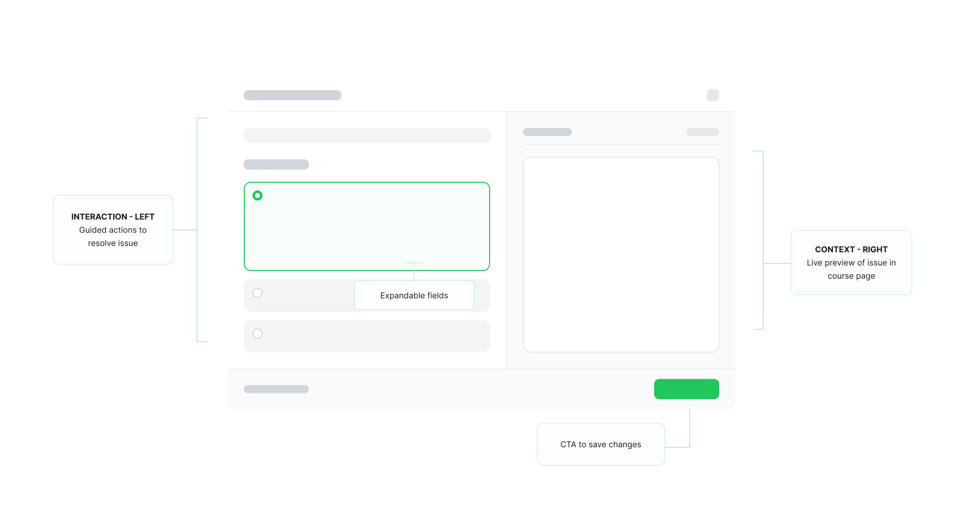
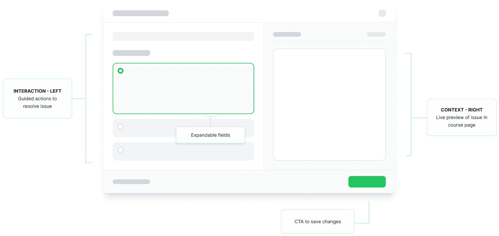
A Unified Remediation Framework

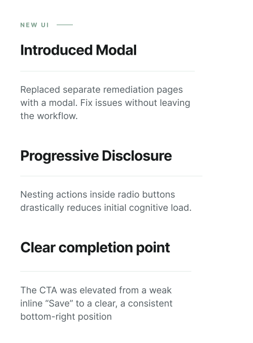
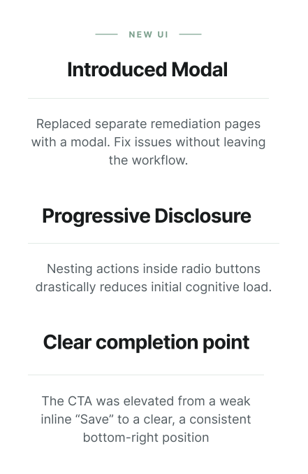
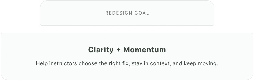
I introduced a shared remediation framework that consolidated fragmented workflows into a consistent interaction pattern across the platform.

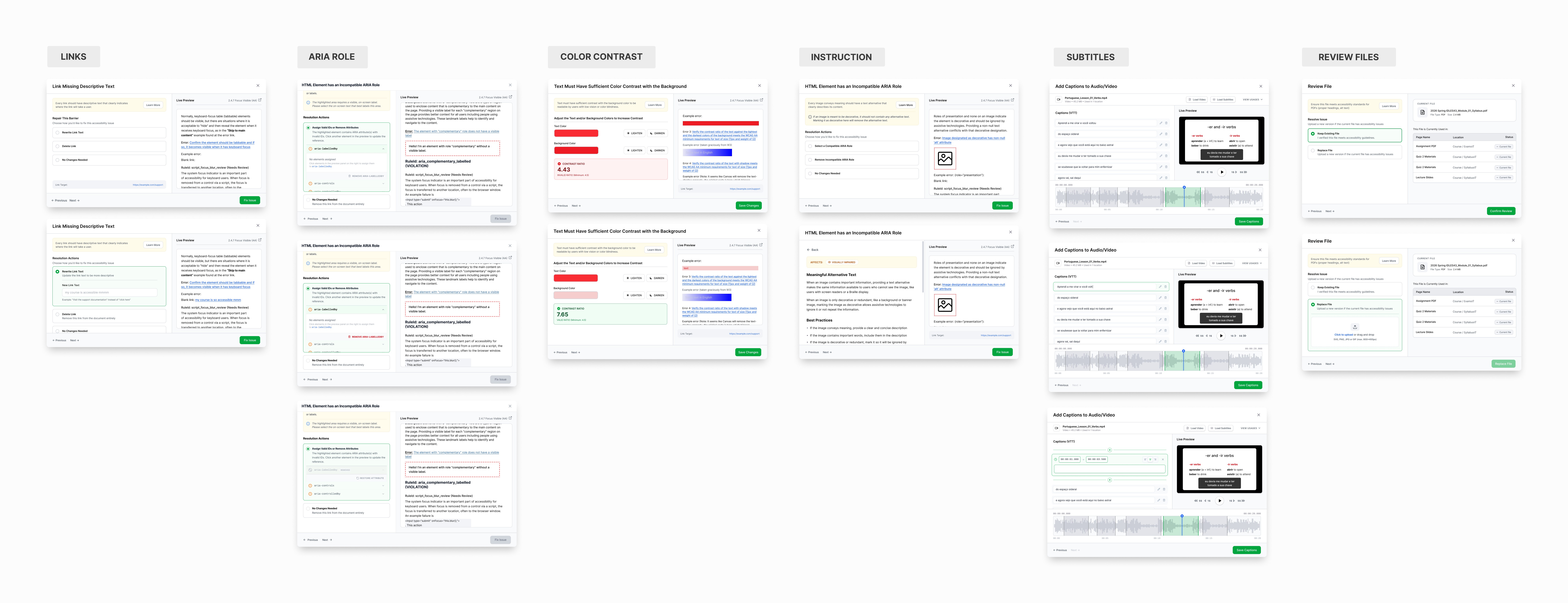
Built to Scale.

Before applying the framework to specific workflows, I needed to make sure it could scale across the many issue types UDOIT supports.

APPLICATION

The Framework in Action

1 Resolving Barriers

Barriers are issues UDOIT can automatically detect and group for instructors. This workflow focused on helping users prioritize issues quickly and move through fixes without losing context.

Original UI

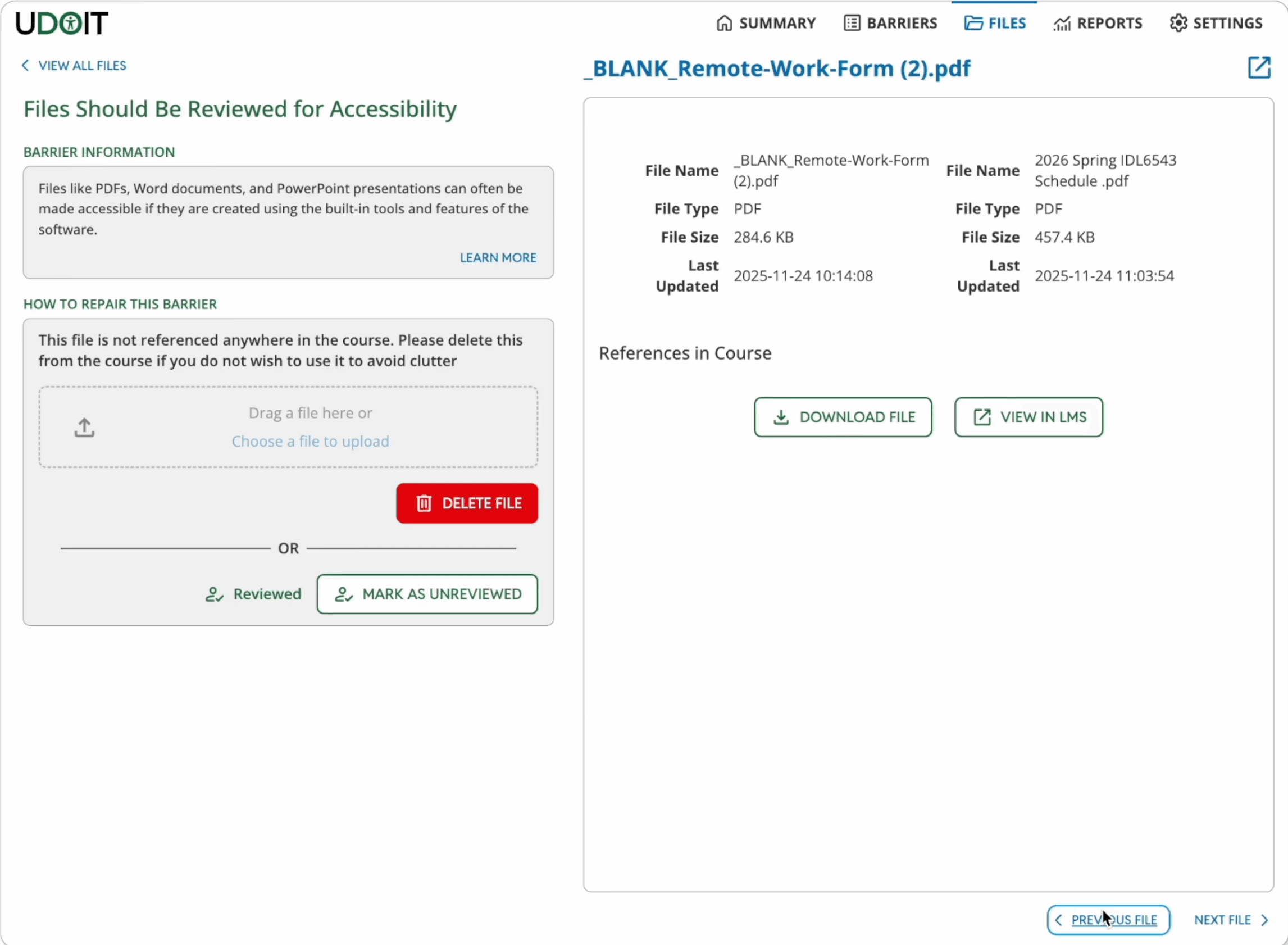
2 Reviewing Files

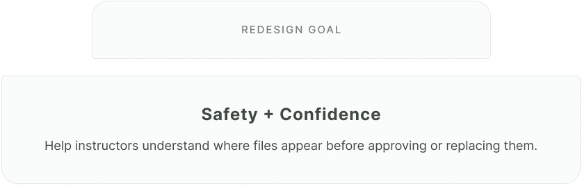
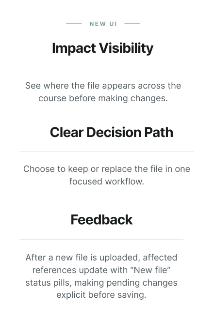
Files required a different kind of remediation. Because UDOIT could not automatically scan PDFs, PowerPoints, and documents, instructors needed to verify accessibility or upload replacement files manually.

Original UI

PROCESS

Exploring the right interaction model

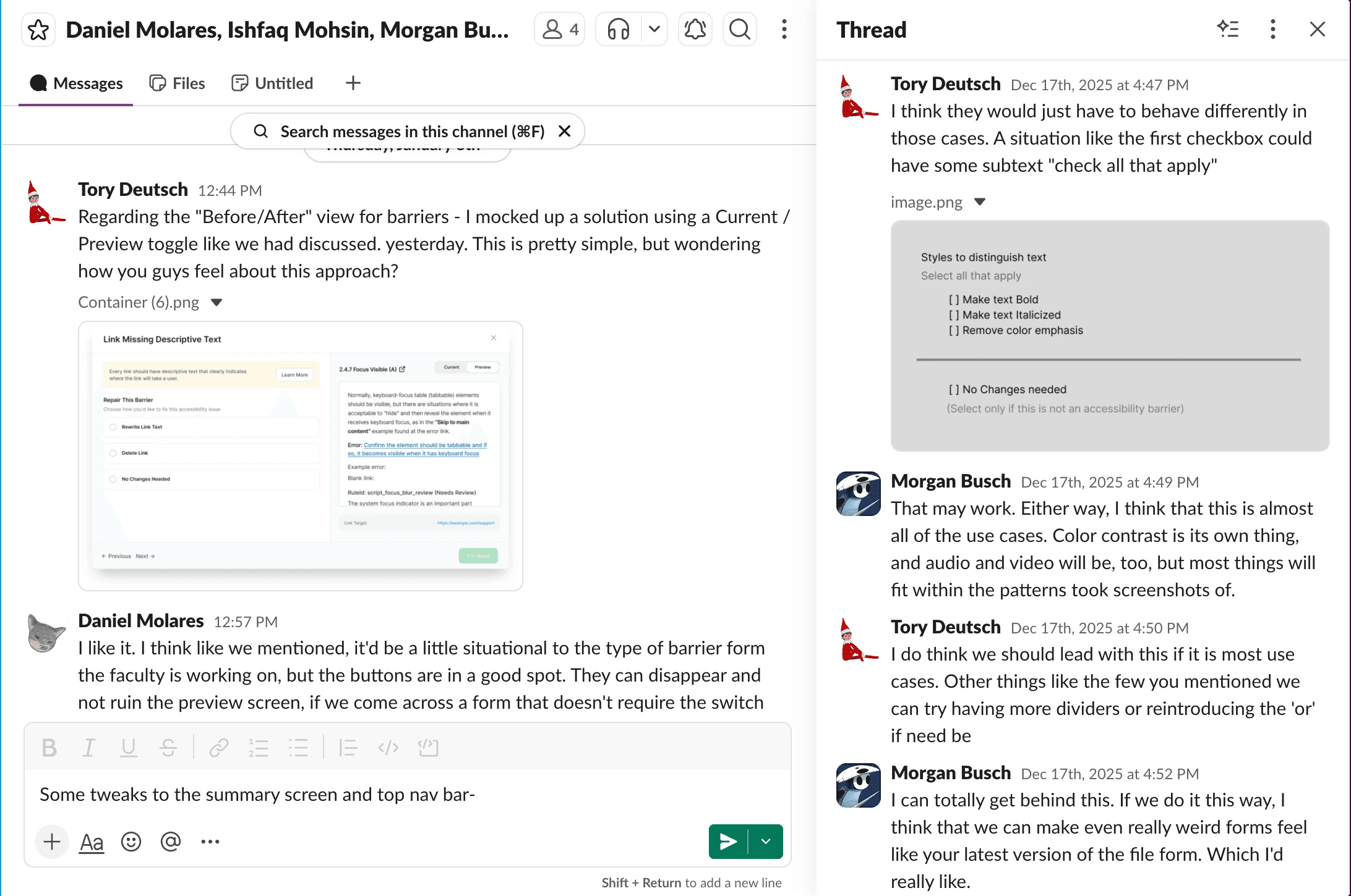
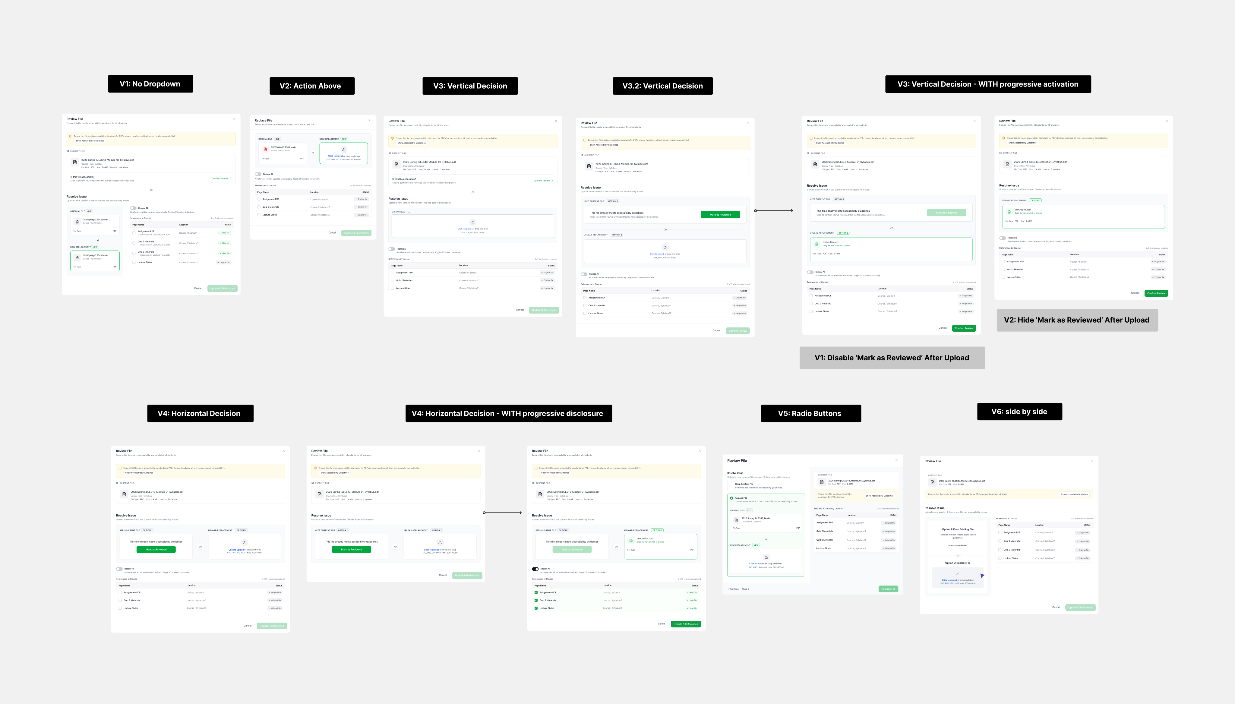
The main challenge was designing one framework that was flexible enough for edge cases, but consistent enough for users to learn once and reuse across the product. I prototyped 300+ screens, exploring different layouts and progressive disclosure patterns.

We ran live demos and A/B tests with UCF faculty to validate which design directions to move forward with.

Working in a small department allowed me to collaborate closely with engineering and design alongside implementation.


Through daily syncs, I worked with engineers to understand the constraints of Canvas LMS and UDOIT’s existing architecture.

lots of brainstorming

END TO END REDESIGN

Designing for Action

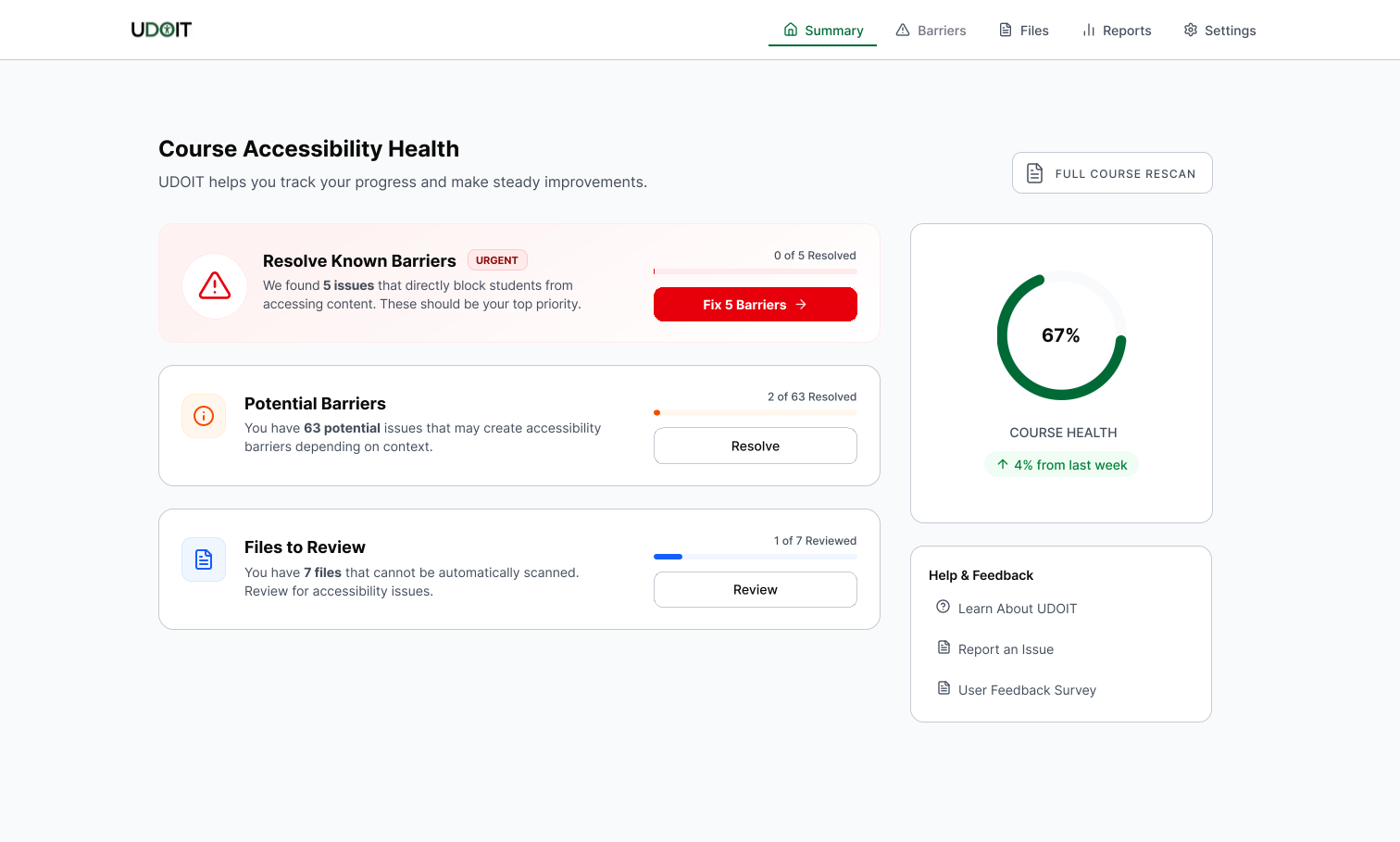
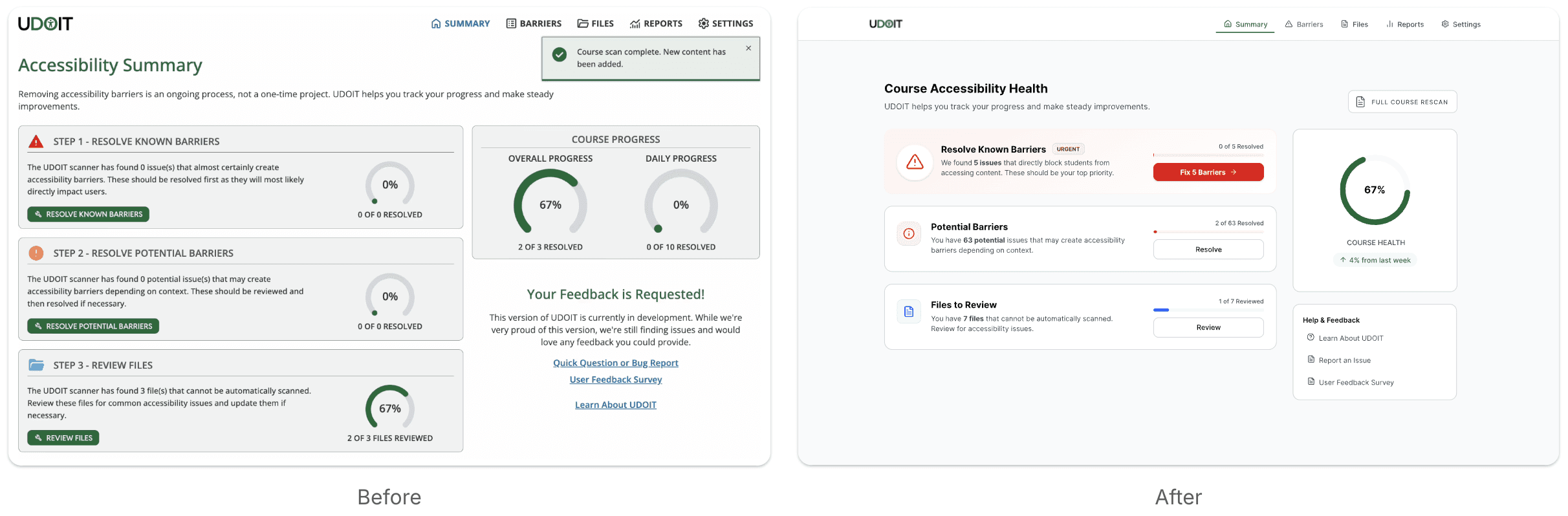
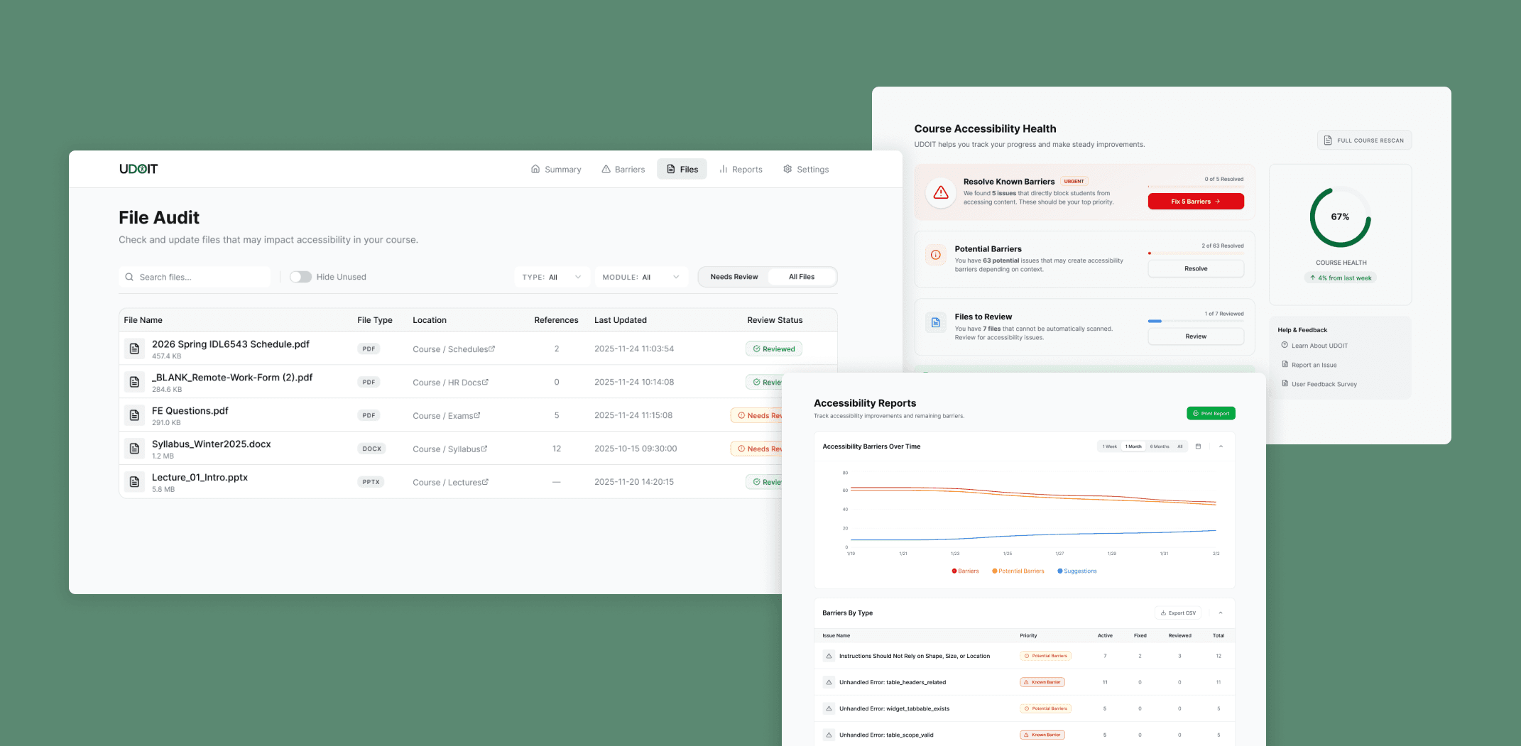
While the remediation framework was the core of the redesign, the broader product also needed to better support action. I redesigned key screens to surface next steps, reduce friction, and make the tool easier to act on.

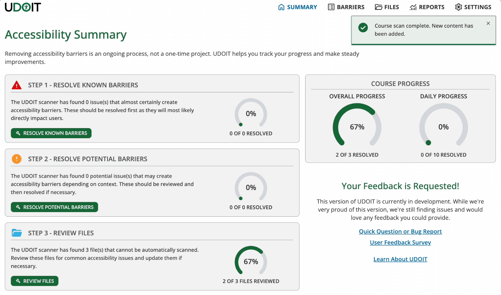
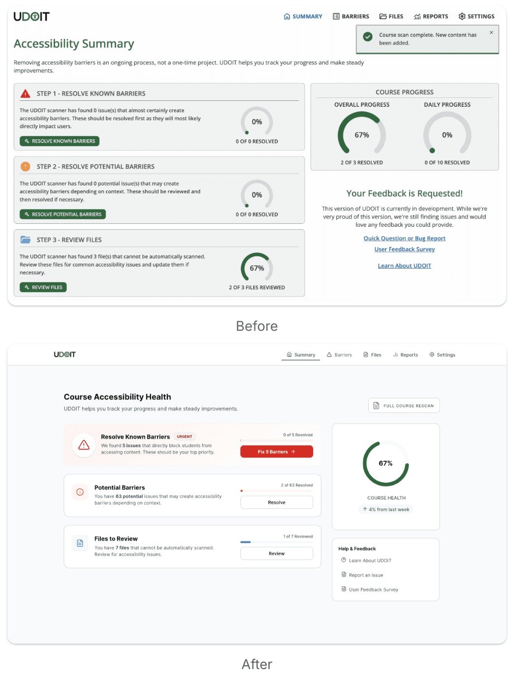
Summary

Redesigned to surface priority issues at a glance while providing a clearer view of overall course health.

Before

After

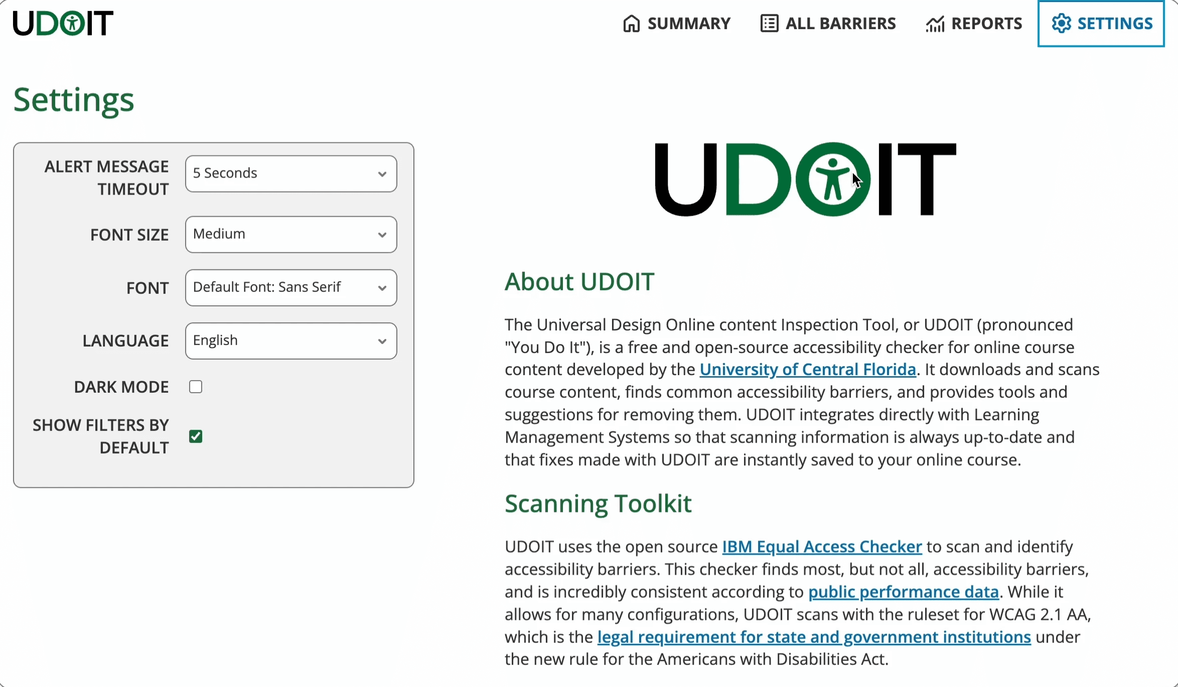
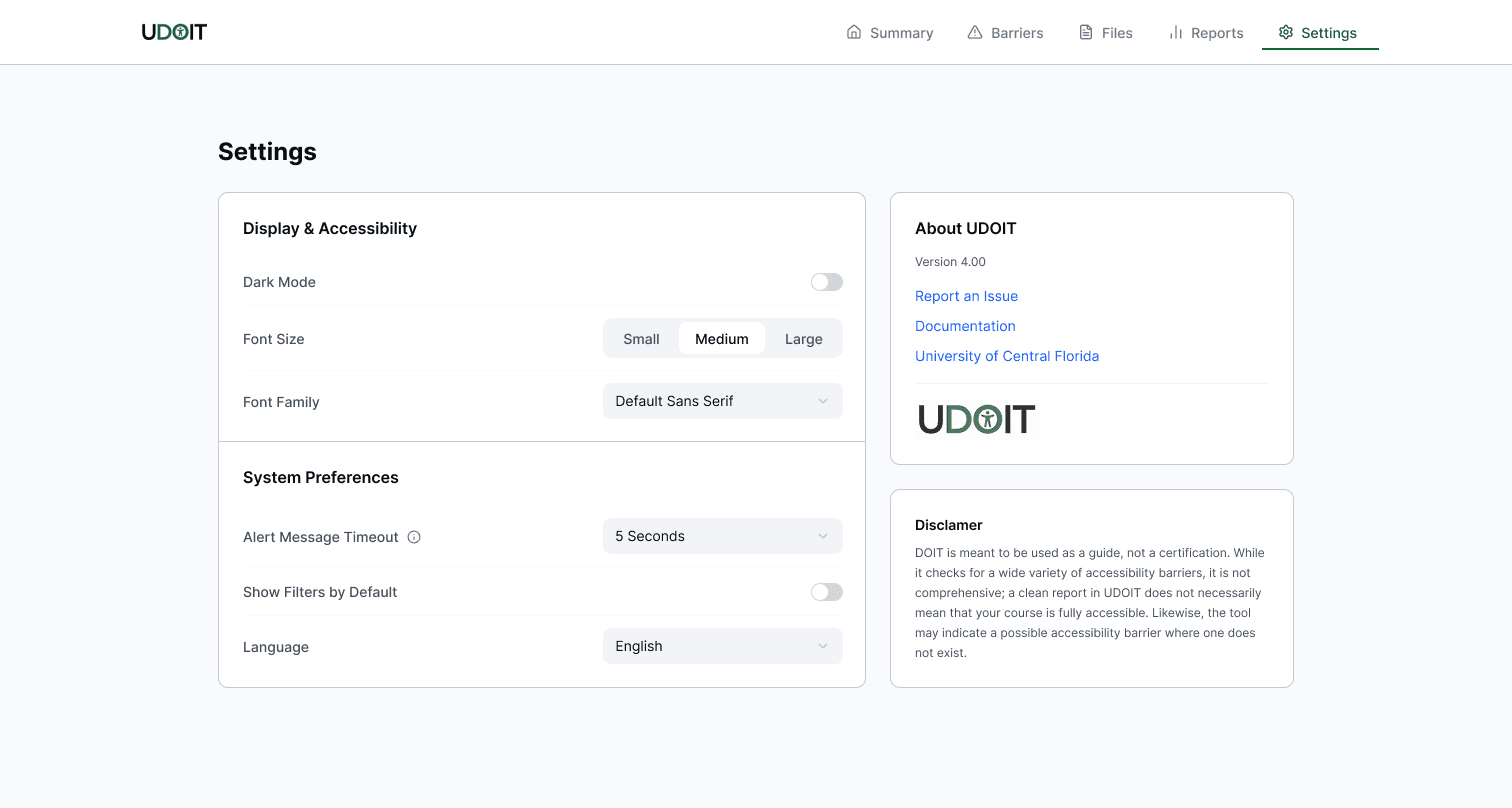
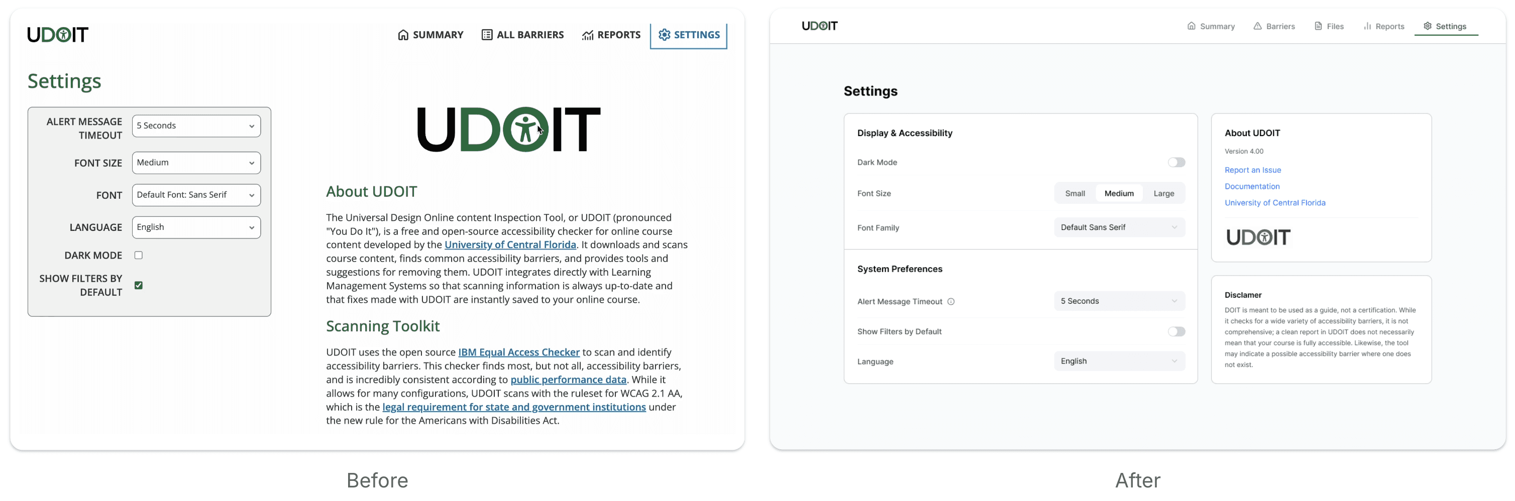
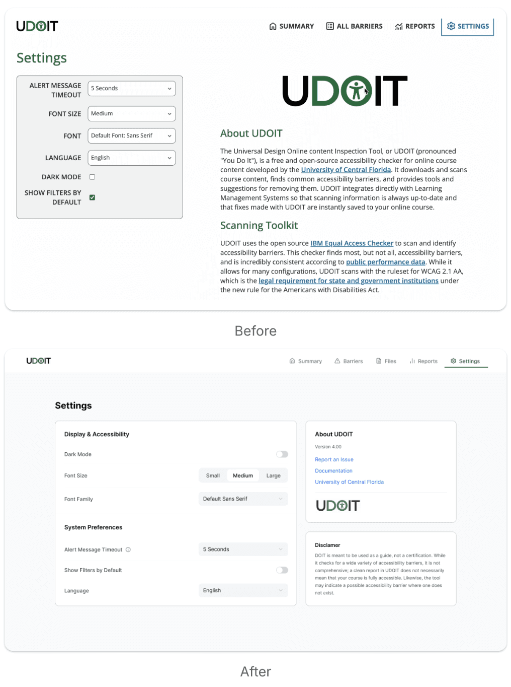
Settings

Reworked to prioritize user controls over documentation.

Before

After

Reports

Made accessibility trends easier to explore by using sliders and expandable fields instead of checkbox controls.

Before

After

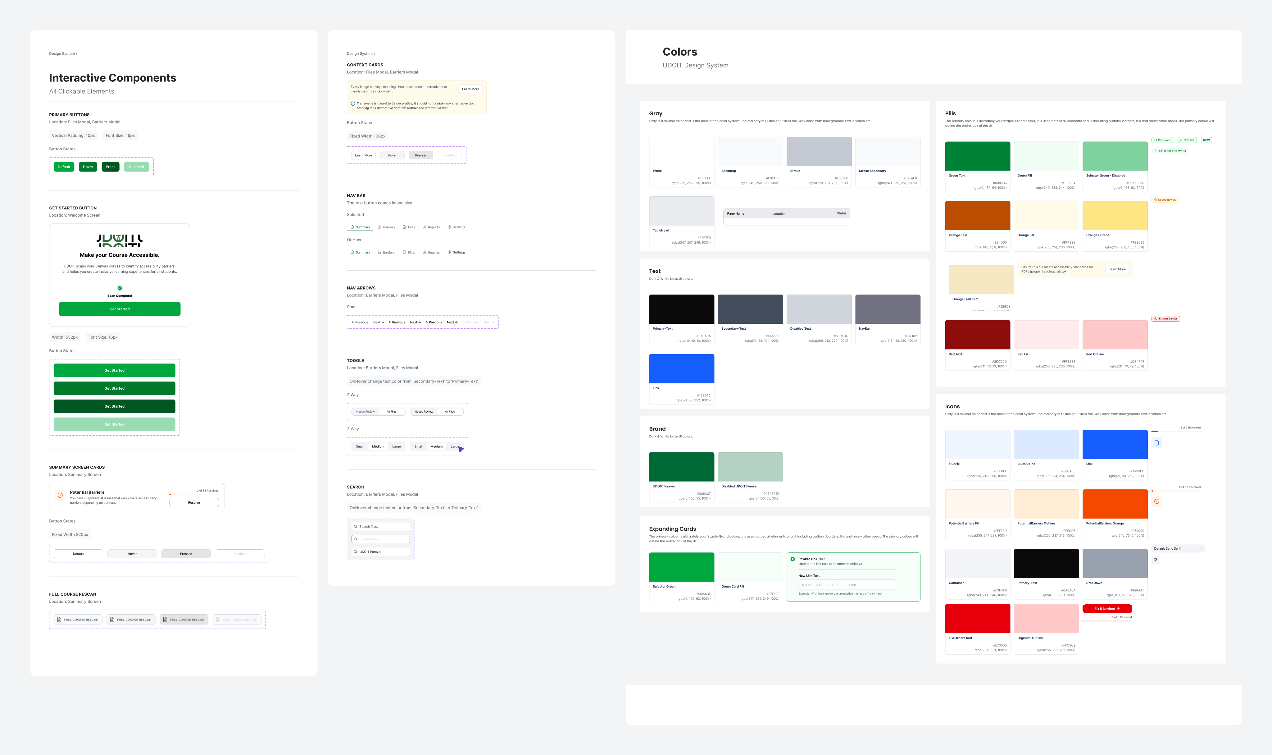
DESIGN SYSTEM

Designing for Consistency at Scale

To support the redesign long-term, I created a product-wide style guide with shared colors, reusable components, interaction states, and dark mode support. This gave the team a consistent foundation for implementation and future iteration.

Dark Mode

REFLECTIONS

What I learned.

I’m deeply grateful for this experience. In a short time, I grew significantly while working on a complex product with a talented team. Here are my key takeaways:

Systems Thinking

  • This project taught me to design beyond individual screens. UDOIT had many issue types, edge cases, and remediation paths, so I had to think in reusable patterns, not one-off solutions.

Accessibility

  • Because UDOIT is an open-source accessibility tool, the redesign needed to model the standards it promoted. I validated visual decisions against WCAG contrast guidelines and defined clear focus states across components to support assistive technology use.

Design Alongside Implementation

  • Working in a small department allowed me to design closely alongside engineering instead of handing off static screens and waiting for implementation. I spent hours in live working sessions with engineers, manually adjusting CSS together, testing contrast, and refining visual decisions in real time.

Iteration + Adaptability

  • This project reinforced the importance of exploring widely and changing direction quickly. I prototyped hundreds of screens before landing on a framework that balanced user feedback with technical constraints.

I’m especially grateful to the engineers I worked with for their support and guidance as I navigated a new product space. I feel lucky to have learned from such a thoughtful, intelligent team.

Thanks for reading!